dCS Mosaic Actus
Iterating on functionality, usability, and visual design to create a more intuitive, engaging, and aesthetically pleasing user experience.

Project Overview
Client
dCS Audio
Team
Nirish Shakya- UX Consultant, Leo Wong- Product Designer, JUSST Engineering- Engineer
Duration
3 years
Year
2021-2024
Skills
(UX) Research
Data Analysis
Wireframing
User Interface
Tools

Figma

Photoshop

Illiustrator

After Effects
Project Index
Introduction
The Mosaic App, introduced in 2018, serves as a pivotal interface between users and dCS Audio products, offering functionalities as a remote control, content browser, and music player. In light of evolving user expectations and continuous feedback since its inception, dCS Audio is embarking on an ambitious journey to develop a new generation of flagship products. A key component of this endeavour is the comprehensive revamp of the Mosaic App to enhance user experience, functionality, and overall satisfaction.
Objective
The primary objective of the Mosaic App revamp is to address and implement solutions to user feedback received over the years. This project aims to refine the app's existing features and introduce innovative functionalities that align with the latest in UX design and technology trends. The ultimate goal is to elevate the user experience, ensuring the Mosaic App meets and exceeds user expectations, reinforcing dCS Audio's position as a leader in the high-fidelity audio industry.

How We Work as a Team
Product Designer (Leo Wong): As the sole Product Designer, I am charged with the comprehensive oversight of the Mosaic App's redesign.
My responsibilities span from the initial conceptualisation of the design strategy through to prototyping and the iterative integration of user feedback. This role is crucial in ensuring that the final product not only aligns with but also anticipates the needs and preferences of our users. I also built the Mosaic App Design Systems from scratch.
UX Consultant (Nirish Shakya): Nirish Shakya, our esteemed UX Consultant, contributes deep insights and methodologies in UX design.
Nirish's role is instrumental in guiding the project's overarching direction, focusing on user research, usability testing, and the application of UX best practices to our design process. Nirish's expertise ensures that our design decisions are informed, user-centred, and strategically aligned with our objectives.
dCS Audio Product Manager (Matt Taylor): Anchoring the project within dCS Audio's strategic product lineup, the in-house Product Manager plays a key role in bridging the gap between the design and development teams and the company's long-term product vision.
dCS Audio Director (David Steven): Providing executive oversight, David offers strategic direction and support, ensuring that the project aligns with the company's mission, values, and business goals.
JUUST (Engineering Team based in Germany): JUUST, our engineering partners based in Germany, bring to the table their technical expertise and experience in developing robust and scalable software solutions.
This team composition reflects a strategic alignment of skills and roles, each contributing uniquely towards the common goal of enhancing the Mosaic App. Through our collaborative efforts, we aim to deliver a product that exemplifies dCS Audio's commitment to quality, innovation, and user satisfaction.
Evaluating the Mosaic App
HYPOTHESIS
Our journey to enhance the Mosaic App's user experience began with a hands-on evaluation. Recognising the importance of understanding firsthand the challenges faced by users, we embarked on an immersive review process using dCS Audio systems. This involved integrating the app into our daily routines, simulating the typical user experience to uncover any pain points or usability issues.
Initial Impressions
Upon launching the Mosaic App, we encountered a series of screens presenting technical information before reaching the main menu. This initial experience, while informative, contributed to a heightened cognitive load, especially as the app displayed a range of options from streaming services to hardware settings without clear guidance on navigation. The absence of physical device connections added to the confusion, making the selection process more daunting.

Navigating Through the App
Choosing a familiar service, Tidal, offered a momentary sense of relief. However, this was short-lived as we were confronted with a login screen followed by a plethora of choices within Tidal itself, such as Tidal Master, Tidal Rising, and various playlists. The lack of clear descriptions for these options led to arbitrary selection, further complicating the user journey. Each choice revealed additional layers of choices, requiring further navigation to reach the desired tracks, playlists, or albums.

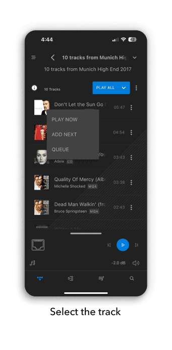
User Experience Challenges
The process of selecting and playing a track unveiled further complexities. Instead of a straightforward play option, we were presented with multiple actions: "play now," "add to playlist," and "add to queue." This unexpected complexity added to the overall frustration. Moreover, navigating to different content or returning to the main menu was cumbersome, heavily reliant on the back button and necessitating multiple steps to restart the process for a new selection.
Insights and Prototyping
This hands-on evaluation underscored the potential frustrations faced by users, highlighting issues such as high cognitive load, unclear navigation, and cumbersome selection processes. Armed with these insights, we commenced the development of low-fidelity prototypes aimed at addressing these challenges. Our goal was to streamline the user experience, reduce complexity, and enhance overall satisfaction with the Mosaic App.
Problem Statement
RESEARCH
Competitive Analysis
RESEARCH

We are doing this by looking through two kinds of apps on the market: streaming services apps like Spotify, Tidal, Deezer, Youtube and Apple Music, and audio system control apps like Devialet, Bang & Olufsen and Roon.
The main outtakes:
- Music first. Always see the music on the home page
- Popular features are Home, Listen Now, Explore, Library and Search
- Images are prominent
- Have a clear hierarchy of information architect
Wireframe Prototype
PROTOTYPING
In response to the identified issues within the Mosaic App—complexity in switching audio sources and an inefficient content browsing experience—we've developed a wireframe prototype focusing on enhancing these specific user scenarios.
Scenario 1: Switching Audio Sources
To address the cumbersome process of switching between audio sources, we introduced a drop-down menu overlay. This design solution allows users to easily switch sources without multiple back button taps, streamlining the user experience and significantly reducing navigation effort.
Key Features:
Drop-Down Menu Overlay: Direct access to all audio sources from any screen, eliminating the need to navigate back to a central menu.
Quick Toggle: Users can swiftly change between sources like streaming services, local files, or internet radio with a single tap.

Scenario 2: Content Browsing Experience
Drawing inspiration from the layout structures of popular music apps like Spotify and YouTube Music, we aimed to create a more visual and intuitive browsing experience. This approach allows users to play a track directly from the top layer of the interface, significantly reducing the number of taps required.
Key Features:
Visual Layout: Emphasising album art and easy-to-read text to make browsing more engaging and less taxing.
Tap and Play: Enabling immediate playback from the browsing interface, streamlining the user journey from selection to listening.
Curated Recommendations: Similar to Spotify and YouTube Music, providing personalised content suggestions to enhance discovery.

Scenario 3: Enhancing Track Search Functionality

Volume Control Enhancement
Acknowledging feedback on the inadequacy of the current volume control, our prototype includes a redesigned volume interface for more precise adjustments.
Key Features:
Volume Knob: A digital knob allows for finer control over volume adjustments, offering an intuitive alternative to the traditional sliding bar.
Enhanced Accessibility: The knob is designed to be larger and more accessible, supporting users who seek a more tactile and precise volume control method.

1st User Testing
PROTOTYPING
We conducted a user testing session for our prototype with a select group of long-term users, some of whom have been engaged with dCS products for over five years. Among these users was a notable reviewer from an audiophile magazine. This session also served as a valuable opportunity to delve into the contexts in which our products are utilised, including the environment, occasions, and user intentions.

Findings
The feedback from this initial round of testing brought to light several encouraging outcomes:
Quick Wins: The redesigned source selector and the streamlined search process were well-received, highlighting immediate improvements in user experience.
Volume Control: The new volume control knob design was a standout feature, receiving positive feedback for its ease of use and aesthetic appeal.
User Expectations: Beyond the specific functionalities tested, users shared their broader expectations for the Mosaic App. There was a notable desire for a more immersive, magazine-like reading experience within the app, along with a call for a more visually oriented design approach that moves away from the current engineering-focused interface.
User Satisfaction
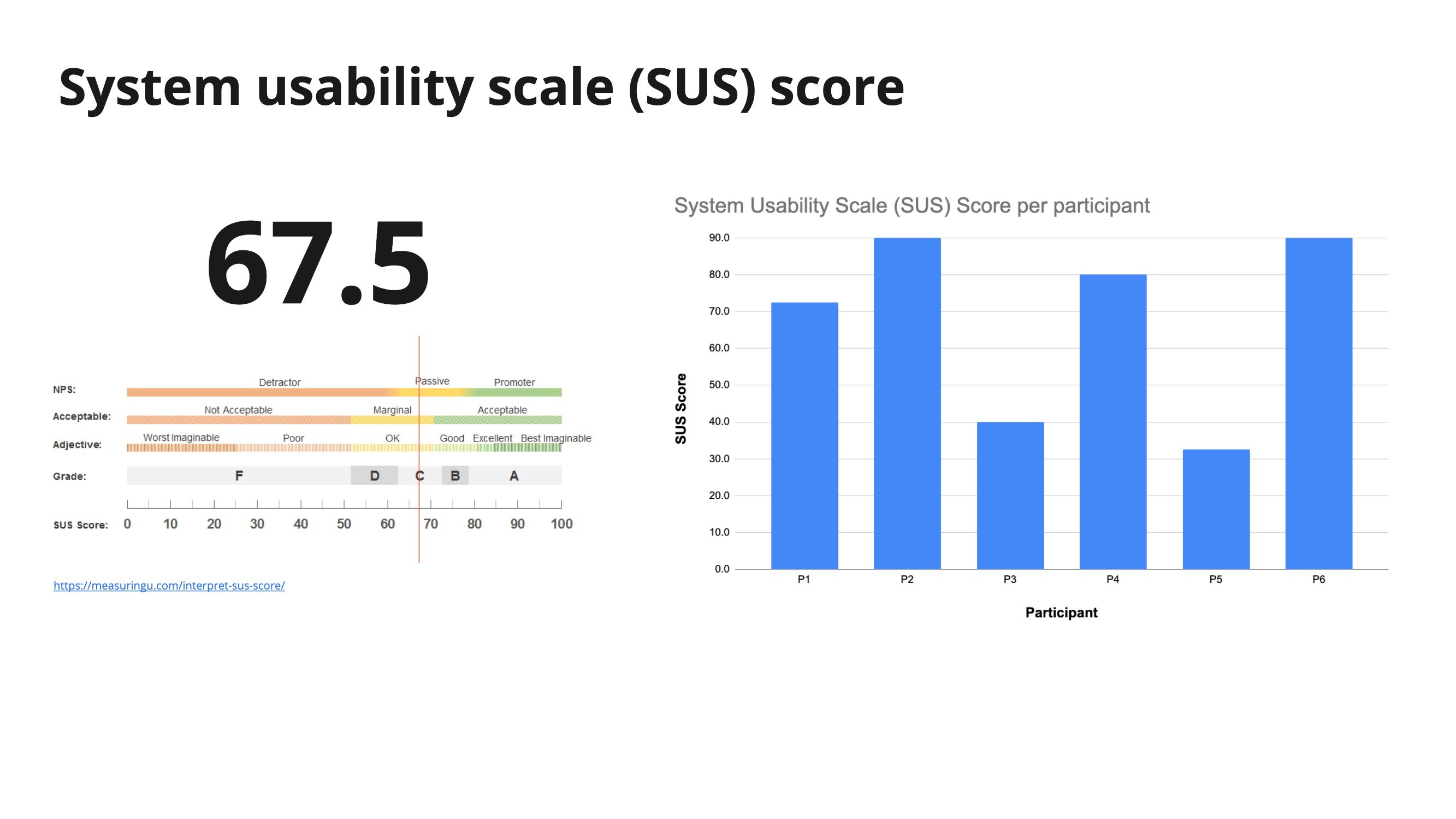
The overall reception of the prototype was moderately positive, achieving a score of 67.5 on the System Usability Scale (SUS). This rating reflects a solid foundation upon which to improve, indicating that while the prototype marks a step in the right direction, there is room for further enhancement to fully meet user expectations.
Finding the common ground
ANALYSIS
Initial Feedback Integration
Following the first round of user testing for the Mosaic App prototype, we gathered a diverse group of stakeholders, including the engineering team, to discuss the feedback. Given that the UX team joined the project at a later stage, the proposed redesign—which aimed to significantly alter the app's user flow and structure—raised concerns among the engineering team due to the potential increase in workload.
Striking a Balance
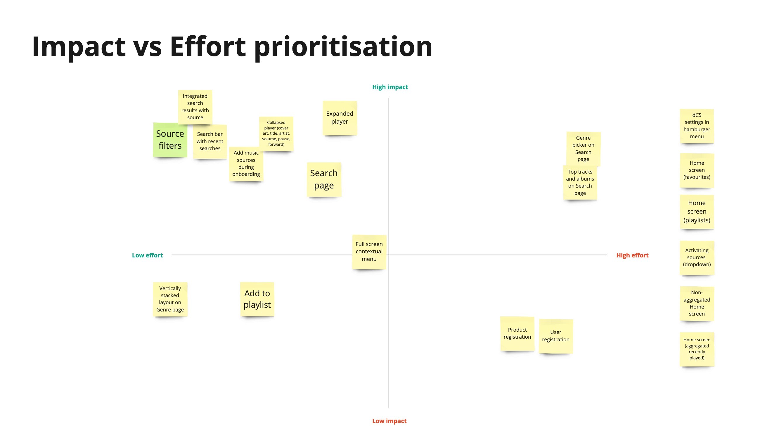
As a team dedicated to enhancing the user experience, our challenge was to find a middle ground that respected both the implementation costs and the need for a superior user experience. To address this, we organised an objective recalibration workshop and a feature prioritisation session. These efforts were aimed at resolving conflicts by aligning on goals and priorities.
Objective Recalibration Workshop
During the workshop, we presented the new design alongside the current version, highlighting the pain points identified through user feedback. This side-by-side comparison provided the engineering team with a clearer understanding of the necessity for design improvements. By directly correlating user feedback with specific design elements, we were able to illustrate the impact of user pain points on the overall experience.

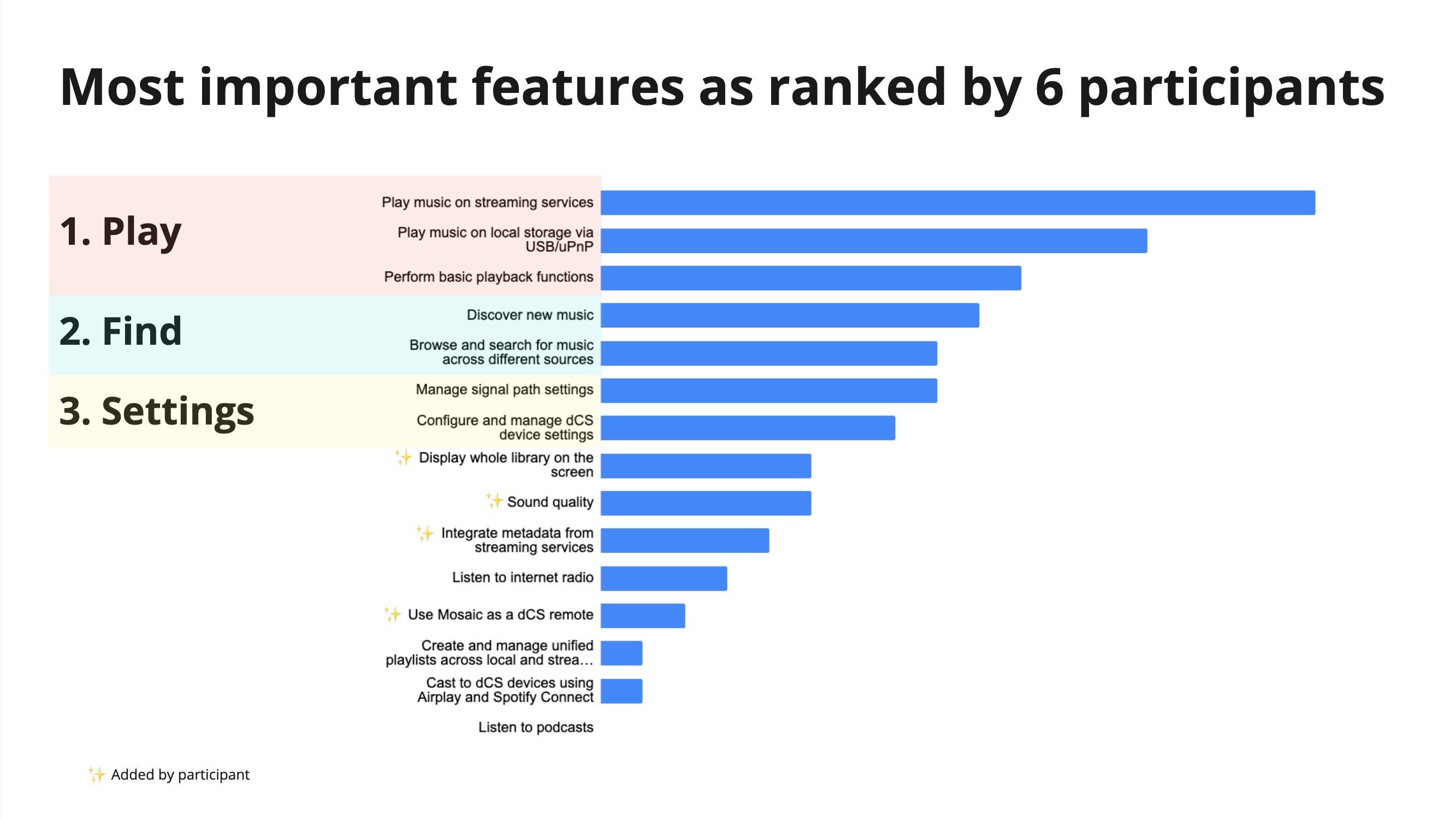
Feature Prioritisation
Having established a fundamental agreement on the importance of redesigning for a better user experience, we proceeded to list out the features identified as critical for improvement. This step involved prioritising "not-to-miss" features that were essential for the next iteration of the prototype. The prioritisation process was crucial in ensuring that we focused on implementing changes that would deliver the most significant impact on the user experience while considering the constraints faced by the engineering team.
Iteration
DESIGN
Settings Menu Redesign
We've replaced the original contextual menu with a dedicated "Settings" section, now located in the top right corner. This change adheres to the universal design practice, making it more intuitive for users to locate and adjust their settings.
User Profile Removal
Recognising the low impact yet high development effort of the user profile function, we've decided to remove this feature.
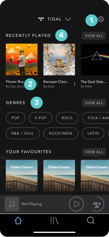
"View All" Button Addition
To enhance navigation and allow users to explore content more freely, a "View All" button has been added to each section. This feature enables users to dive deeper into content without the pressure of making immediate decisions, preserving the original user flow for existing users..
Metadata Integration
After consulting with JUUST regarding feasibility, we've moved forward with fetching metadata directly from streaming services. This enhancement enriches the content browsing experience, providing users with valuable information about their music choices.
Volume Control Redesign
To optimise interface space, the volume knob has been replaced with a volume control button within the collapsed player. This adjustment minimises the vertical space consumed by the volume control function, making more room for content.
Play-Queue Adjustment
Based on user feedback indicating that the play-queue feature was not widely used, we've removed it from the Navbar. This feature has been relocated to a more appropriate playback-related category, simplifying navigation and focusing on more frequently used functionalities.


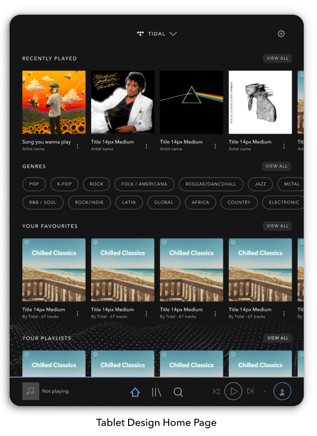
Tablet Design
DESIGN
Following user testing, which helped us refine and validate the primary user flows of the new Mosaic App, our focus shifted toward adapting the mobile experience for tablet use. This transition aimed to leverage the larger screen real estate of tablets while maintaining the app's core functionality and aesthetic appeal.
Design Adjustments for Tablet
The adaptation process for the tablet screens involved several key adjustments:
Screen Translation: I meticulously translated the mobile screens to tablet, ensuring that the essence of the design was preserved.
Font Size and Tap Areas: Adjustments were made to font sizes and tappable areas to enhance readability and usability on the larger display.
Breathing Space: I allocated additional space around UI elements, aiming to create a more luxurious look and feel, characteristic of the premium experience our users expect from the Mosaic App.
Expanded Player Screen Challenge
One of the main challenges encountered during the tablet design phase was the adaptation of the expanded player screen. The mobile version was designed to house one action per screen, with four taps dedicated to the expanded player. Directly translating this design to the tablet could result in an interface that appeared too sparse.
Innovative Solution
To address this, we innovated our approach to the tablet's expanded player screen:
Persistent Transport Controls: Recognising the importance of transport controls (play, pause, skip, etc.), we ensured these controls were visible at all times, providing users with constant access to essential playback functionalities.
Secondary Feature Integration: We maintained the ability to switch between secondary features (such as play-queue, volume control, and signal path settings) through tapping. However, we designed these elements to seamlessly integrate into the expanded player layout without overwhelming the user interface.


2nd User Testing
PROTOTYPING
Building on the insights from our initial user testing and feedback from the engineering team, we implemented several key changes to the Mosaic App prototype. To further enhance the user experience and closely mimic the functionality of a real app, animations were added to elevate the prototype to a higher fidelity.
Findings
The adjustments made to the Mosaic prototype were met with positive feedback from participants, who noted its visual appeal, premium design, and overall high-quality user experience. The enhancements contributed to a significant improvement in the System Usability Score (SUS), which soared to 86.3 from the previous 67.5. This leap underscores the effectiveness of the iterative design process in addressing user needs and enhancing usability.
Key opportunities identified during this round of testing include:
Localisation: Tailoring the Mosaic App to better suit the user's region, providing a more personalised and relevant experience.
Desktop Experience: Expanding the Mosaic ecosystem by creating a desktop version of the app, catering to users seeking a more versatile listening experience.
The report further details contextual user insights and strategic opportunities that emerged from the testing. Among these, participants highlighted the importance of the most commonly used functions while engaging with music: changing the volume, skipping tracks, and accessing more information about the current track.

2nd Iteration
DESIGN
Settings Menu Iteration
Recognising the need to incorporate additional functionalities—such as switching the device into sleep mode and swapping between dCS devices—we introduced a new overlay that appears before accessing the settings. To accommodate this new overlay and streamline access to settings, we transformed the settings cog icon into a 3-dot menu.
3-dots menu removal at track selection
Feedback indicated that the 3-dots menu alongside tracks was taking up excessive space, making track titles difficult to read. In response, we removed this menu from the track view, integrating its functionalities directly within the tracks and playlists interface.
Metadata Rearrangement
User feedback revealed that the genre feature was deemed the least important by our users. Acting on this insight, we moved the genre information to a lower position within the metadata display.
Font Size Optimisation
Acknowledging that our primary user demographic falls within the 50s to 60s age range, we identified the need for larger font sizes to improve readability. We increased the size of title fonts and track information, optimising the user experience for those with varying degrees of visual acuity.
Expanded Player
In response to insights garnered from our second round of user testing, we embarked on a series of targeted enhancements to the Mosaic App's expanded player. Our focus was on refining the tap design, optimising space usage, and improving overall user interaction within the expanded player interface.
Refined Tap Design
Users previously encountered a two-step process to exit volume control or the play-queue, involving an overlay pop-out and multiple taps. To streamline this experience, we introduced a persistent tap button available across all tap options. This design change allows users to exit the expanded player with a single tap, significantly enhancing usability and clarity within the interface.
Transport Control Integration
Recognising the user's desire for continuous control over playback, we integrated transport controls (play, pause, skip) directly within the volume control tab. This addition leverages the available space effectively, ensuring users have full playback control at their fingertips without needing to switch contexts.
Album Art Removal in Play-Queue
Feedback indicated that displaying album art within the play-queue was redundant and occupied valuable screen real estate. In response, we removed album art from this view, freeing up vertical space for a more extensive list of the play-queue and enhancing the interface's efficiency.
Streaming Service Logo Alignment
To comply with the brand requirements of various streaming services and ensure a cohesive visual presentation, we conducted a thorough review of branding guidelines. This led to the standardised placement of streaming service logos.

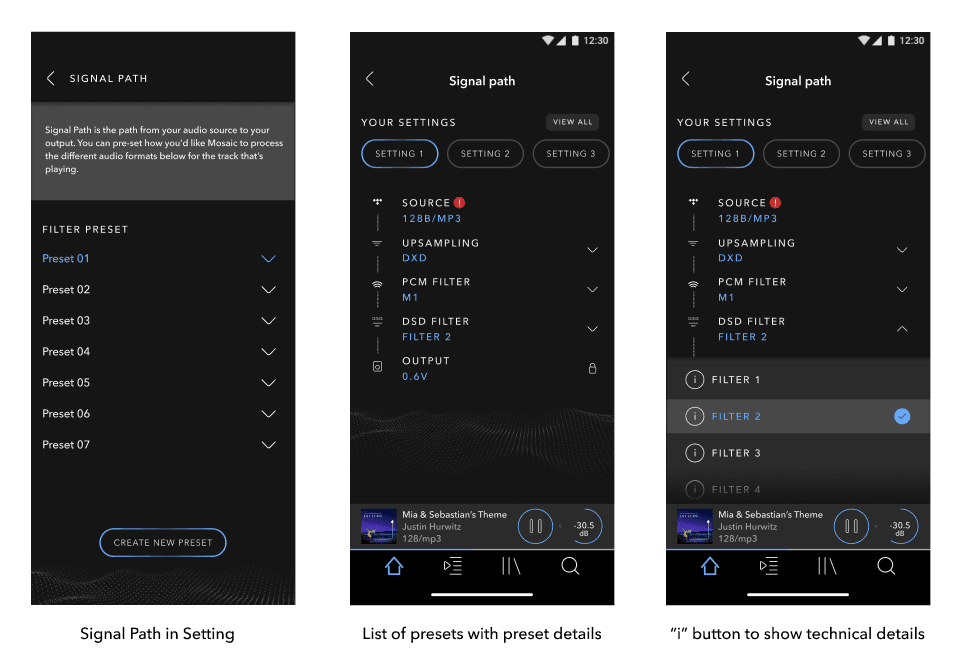
Signal Path Setting Design
DESIGN
The design process for the Signal Path setting in the Mosaic App began with a comprehensive review of the feature's requirements, obtained from the dCS Engineering team. This involved listing all available settings and organising them into a tree diagram for clarity. Our goal was to enhance user engagement with this advanced feature, which allows for the customisation of audio settings such as Filters, Upsampling, and Mappers.

Identifying Limitations
Through testing the existing implementation of Signal Path, we identified several limitations:
Limited Customisation: Users could only modify settings for the currently playing track, with changes reverting upon system shutdown.
Lack of Preset Saving: There was no capability to save customised settings as presets.
Insufficient Information: The interface listed options without explanations, leaving users unsure about the effects of their adjustments.
Leveraging Community Insights
Exploring the dCS forum revealed a community of users eager to share their custom presets for different genres. This insight highlighted the potential for enhancing the Signal Path feature by incorporating a preset-sharing capability.

Designing the User Flow
Addressing the complex nature of creating and saving presets posed a significant challenge. Considering the variability in preset availability across sample rates and the specificity of filter options to audio formats, the task required careful consideration to ensure a user-friendly experience.
Simplifying the Experience
To mitigate complexity and encourage user experimentation with settings, we collaborated with the engineering team to identify a set of "dCS Presets." These presets serve as a recommended starting point, reducing the burden on users to adjust settings for each sample rate or format.

Enhancing User Understanding
To further empower users, we introduced an "info" button next to each filter selection. This feature provides contextual information about what each filter does, demystifying the Signal Path setting and encouraging informed customisation.
Prototyping
The culmination of this process was the development of our first Signal Path design prototype. This version aimed to balance the advanced capabilities of the feature with accessibility and ease of use. By streamlining the preset creation process and enhancing informational support, we sought to provide a more engaging and intuitive experience for dCS Audio users.
User Testing
As part of our continuous effort to refine the Mosaic App, we conducted a usability test focusing on the main features, with a particular emphasis on gathering feedback for the Signal Path design. This testing phase was crucial in understanding how users interact with the Signal Path settings and identifying areas for improvement.
Key Findings
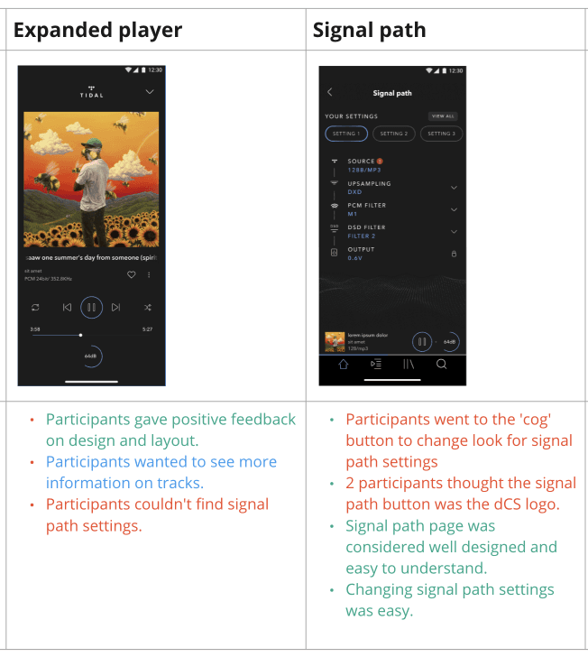
Expanded Player Expectations: A significant insight was that several users expected to access and modify the Signal Path settings directly from the expanded player, viewing it as the central control hub for their listening experience.
Iconography Confusion: Users reported confusion regarding the current icon used to denote the Signal Path setting, mistaking it for the dCS logo.
Ease of Use: Despite the initial confusion over iconography, users found the process of changing the Signal Path setting and selecting presets straightforward and user-friendly.
Incomplete Test Plan: Feedback from the testing highlighted that the test plan did not fully capture the breadth of interactions users have with the Signal Path feature. To address this, future testing will need to encompass a wider range of scenarios and user behaviours to gain a comprehensive understanding of how users engage with and perceive the Signal Path settings.
Challenges Faced in Developing Signal Path Configuration Concept:
Divergent Stakeholder Perspectives:
Throughout the development process, stakeholder input constantly varied, resulting in conflicting ideas for the ideal user experience. The challenge was to find common ground that aligns with both user needs and business objectives, requiring frequent iterations and adjustments.
Limited External Resources for User Testing:
Due to the highly confidential nature of the product, accessing external resources for comprehensive user testing was constrained. This limitation made it challenging to gather diverse user feedback and insights that could have significantly contributed to the refinement of the Signal Path feature.
Approach
Iterative Design Process:
Despite the challenges, the team adopted an iterative design process, incorporating the diverse perspectives of stakeholders into multiple design rounds. Each iteration was based on the evolving understanding of user preferences and technical capabilities. The process involved continuous prototyping, testing, and refinement to align the product with stakeholder requirements and user expectations.
User-Centric Customisation:
Understanding the varying expertise levels of users, the design emphasised user-centric customisation. The interface enabled users to switch between existing presets quickly while listening to music and offered the option to modify them and save them as new configurations. Advanced users were given precise tweaking options to refine presets according to their preferences.

Decision to Pause Iteration
PROTOTYPE LINK
After six rounds of intense iteration, the team faced a critical decision point. Considering the complex nature of the stakeholder inputs and the limited external resources for user testing, the team chose to implement the current design version for user use. Recognising the necessity to maintain project momentum and meet deadlines, the decision to pause the iteration process was made with a commitment to continue refining the Signal Path feature post-launch based on user feedback and additional insights.
Conclusion

As we conclude the case study on the revamping of the dCS Mosaic App, it's important to acknowledge that the app has not yet been launched into the market. This presents a unique moment in the project lifecycle—where anticipation meets preparation. Throughout this journey, we've embraced a rigorous process of discovery, ideation, and testing, guided by a clear commitment to enhancing functionality, usability, and visual design. Our approach has been deeply informed by user feedback, competitive analysis, and a forward-thinking design philosophy.
Although the final verdict from the wider user base is pending, the insights gained and the iterative refinements made promise a significantly improved user experience. We are poised on the cusp of introduction, armed with a product that we believe will not only meet but exceed user expectations, setting a new standard for audio system interfaces.
Looking ahead, the launch will mark the beginning of a new chapter. We anticipate gathering further feedback from actual use cases, which will serve as invaluable input for ongoing improvements. The journey of the Mosaic App revamp is a testament to the power of user-centered design and collaboration. It underscores our dedication to excellence and our unwavering focus on delivering a product that resonates with users and enriches their interaction with dCS Audio systems.