dCS Audio Design System
Iterating on functionality, usability, and visual design to create a more intuitive, engaging, and aesthetically pleasing user experience.

Project Overview
Client
dCS Audio
Team
Leo Wong- UI Consultant, JUSST Engineering- Engineer
Duration
3 years
Year
2021-2024
Introduction
As the UI Consultant for dCS Audio, I was tasked with overhauling the Mosaic App's design system. The existing setup presented several challenges, including cluttered documentation and inconsistent use of icons and fonts. Recognizing the need for a cohesive and scalable design system, I initiated the development of a new design framework from scratch, aiming to standardize UI components for future dCS products and elevate the visual aesthetics of the new Mosaic App.
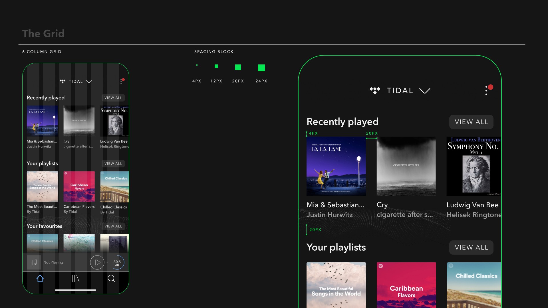
The Grid
I implemented a 4x pixel grid rule throughout the design to ensure consistent spacing across all elements. This approach simplifies the design process and enhances the visual harmony of the interface, making the app more structured and visually appealing.
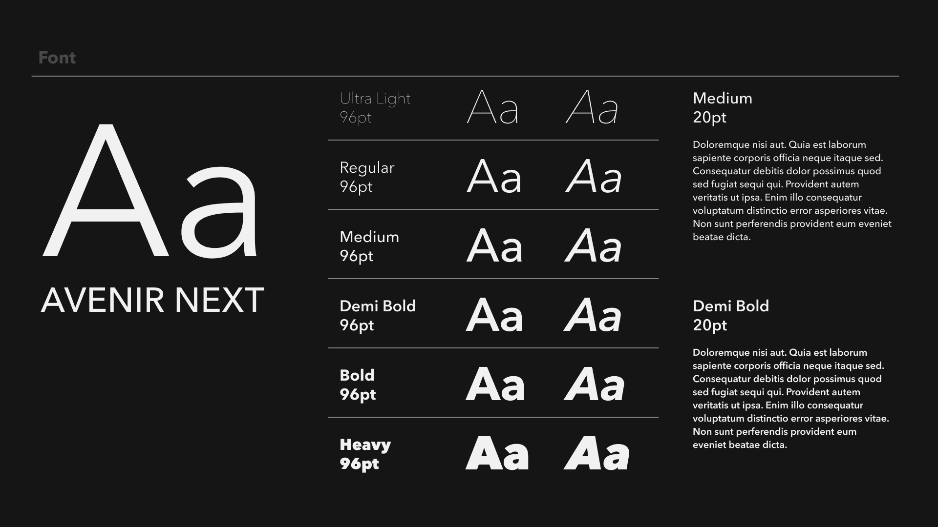
Typography
Transitioning from Avenir to Avenir Next allowed us to utilize a wider range of font weights, maintaining brand continuity while enhancing readability and elegance. The strategic use of thin and heavier weights contributes to a luxurious look and feel, aligning with the premium quality of dCS products.

Iconography
Given the unique requirements of high-fidelity audio systems, creating a set of custom icons was essential. Each icon was meticulously crafted, with careful consideration given to the stroke weight to ensure clarity and a sleek appearance. This detailed process ensures that each icon not only meets functional needs but also complements the luxurious aesthetic of the Mosaic App.


Colour Palette
The design system incorporates a dark mode by default, building on the existing palette but with adjusted contrasts to improve accessibility and enhance the luxury vibe. This choice not only aligns with modern app design trends but also supports better visual ergonomics in various lighting conditions.

Buttons
Each button is designed with a minimum height of 44px to ensure ease of use across all devices, particularly on touchscreens. The buttons feature distinct outline strokes in varying colors to enhance visibility and user interaction, reinforcing the app's sophisticated design language.

Dropdowns and Content Listing Components
For dropdowns and content listings, the design system emphasizes clarity and ease of navigation. The components are crafted to be intuitive, with clear demarcation and ample spacing to facilitate user selection and improve overall interaction flow within the app.


Conclusion
The new design system for the Mosaic App represents a significant step forward in the visual and functional coherence of dCS Audio's software offerings. By establishing a robust and scalable design framework, we have laid the foundation for future product developments, ensuring consistency and a high standard of user experience. This system not only addresses the immediate needs of the Mosaic App but also sets a new benchmark for the design of luxury audio system interfaces.
